Your AI-Built Website Probably Has a Twin. Here's How to Make Sure It's Not Costing You Leads.
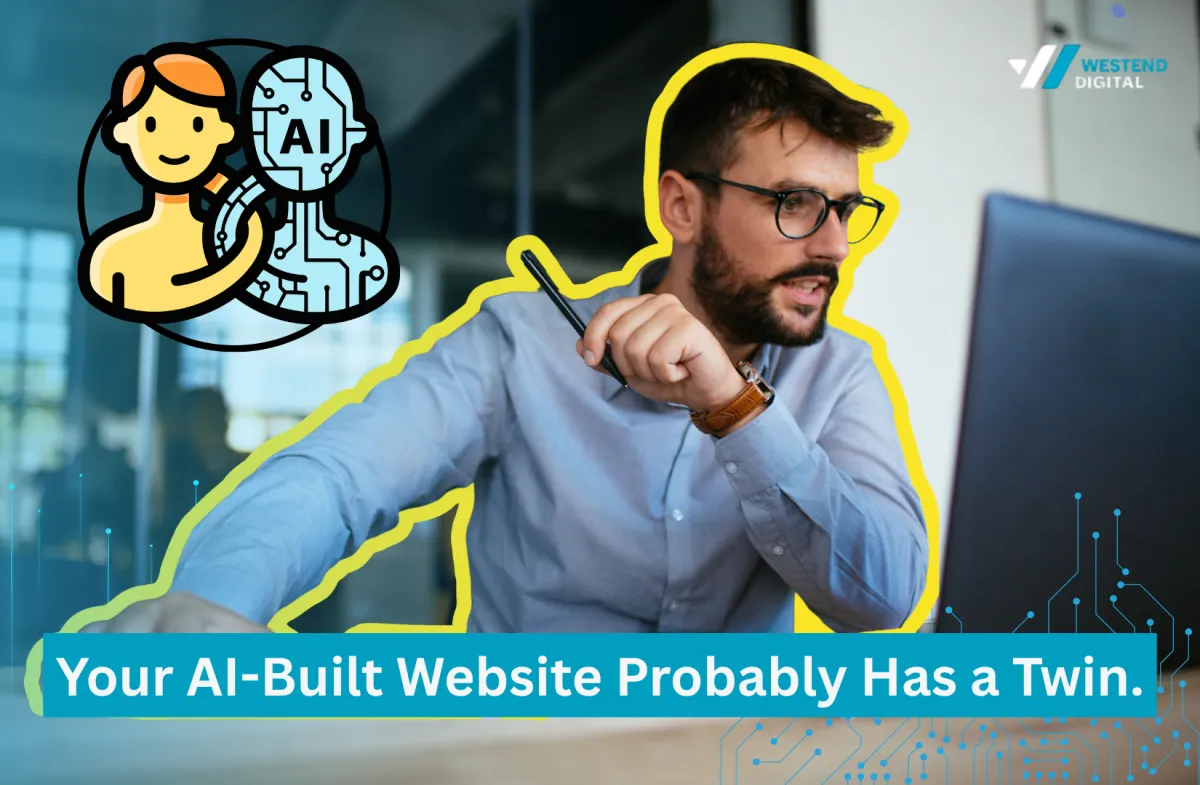
Somewhere right now, a business almost identical to yours is chasing the same customers with a website that looks exactly like yours. Same hero section. Same feature grid. Same layout logic, top to bottom.
We call this The AI Twin Effect: what happens when a business owner describes their company to an AI website builder and gets back the same structural output thousands of other businesses got back too. It's not a rare glitch. It's the default outcome, and there's a real chance your own site is one half of a pair you've never seen.
We're not writing this as AI sceptics. Westend Digital builds with generative AI every week, and we think agentic AI will reshape most professional services within the decade, [website design](/services/website-design) included. This is a piece about one specific failure mode inside that shift, one that's quietly costing businesses leads right now, without ever showing up in their analytics.
Why The AI Twin Effect happens, and why almost nobody notices it
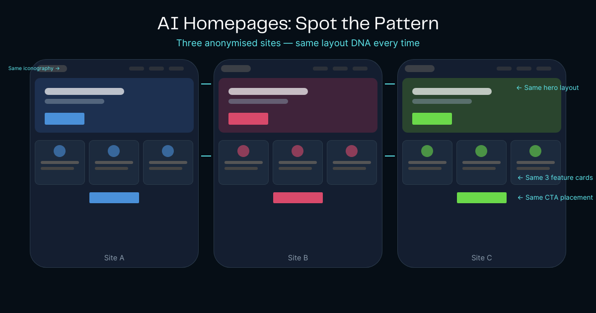
Here's the mechanic in one line: the AI generating your layout isn't designing anything. It's predicting the statistically most likely output for the prompt it was given, and that prediction is always the average of everything the model has seen before. When thousands of businesses run a similar two-sentence prompt through the same handful of tools, they get variations on the same average. A plumber, a law firm, and a bakery all end up with the same hero section, the same three-icon feature grid, and the same contact form at the bottom. Not because the technology is limited. Because that's exactly what it was built to do: remove the guesswork, which also removes the difference.
The reason almost nobody notices is that The AI Twin Effect never announces itself. Your site looks finished. It looks professional. It ticks every box a checklist would ask for. The only way you'd know it has a twin is if you happened to stumble across the twin itself, which is exactly what happened to us.
The proof, not just the theory
You don't have to take our word for this. A number of free tools now scan a URL and return a confidence score indicating which AI builder likely produced a given site (Lovable, v0, Bolt, and a dozen others). These tools aren't definitive proof of anything, they're pattern-matching against known visual and code fingerprints, but the fingerprints themselves are consistent enough to be worth naming: purple-to-blue gradients, glassmorphism cards, the same line-icon set, a green "status" dot in a pill badge sitting in the hero section (lifted straight from SaaS dashboard UI and applied to businesses that have nothing to do with uptime), and feature grids that repeat across industries that have nothing else in common.
The moment we saw it ourselves
A few months ago we rebuilt our own site, working with Claude, aiming for a darker, more premium rebrand. Five iterations in, the structure was strong and the team was genuinely pleased with it, though we flagged the same thing independently: the bullet points felt familiar, the iconography a little too generic. Good, but borrowed, not owned. We treated it as a first cut rather than a finished product and committed to shipping one deliberate, human-made change every week after launch.
A week after we went live, at an industry workshop, we spent 45 minutes talking with the founder of an AI voice-assistant startup, comparing notes on where the industry was heading. We exchanged business cards. The next day, doing the ordinary post-event follow-up, we looked up his business.
There were two live websites for the same company. The first was a near-exact replica of the site we'd just spent weeks refining: same section order, same layout logic, same structural DNA, different font. We scrolled past the hero section and felt the strange, specific discomfort of watching your own reflection wear someone else's clothes. The second site was a straight white-theme variant of the identical template. Same skeleton, second coat of paint.
It took a moment to place the feeling. Not offense, exactly. Something closer to recognition: this wasn't a coincidence or a copy, it was the model's default, showing up twice in one day because we happened to go looking. In the months since, we've found roughly ten more businesses, across trades, professional services, and hospitality, running some version of the same underlying template. We've stopped reacting to it. Now, when we spot it, we just note it and move on, because we already know how common it's about to become.
The biggest risk isn't having an AI website. It's having the same AI website as everyone else.
The honest case for AI-generated websites
This isn't an argument for avoiding AI builders altogether. For an MVP, a conference landing page, an internal tool, or anything that needs to be live by Friday, they're genuinely strong: fast, and considerably cheaper than a full custom build. The failure isn't in using the tool. It's in publishing the tool's default output as a permanent brand asset and assuming "professional-looking" and "recognisably yours" are the same claim. They aren't, and the gap between them is exactly where The AI Twin Effect lives, and exactly where [brand strategy](/services/branding) earns its keep.
Why this is a business problem, not an aesthetic one
Picture the buyer's side of this for a second. They're comparing three or four businesses like yours, all open in separate tabs, all deciding in the first few seconds whether any of you looks worth a phone call.
Website credibility judgements form in about 50 milliseconds, and roughly 75% of people say a company's website design directly shapes whether they trust it, according to the Stanford Web Credibility Project (as reported by Utsubo. Separately, a 2025 analysis of consumer data by Klaviyo and Datalily found that close to a third of consumers say content they can visibly identify as AI-generated makes them trust a brand less, with only a small fraction saying it builds more trust, and a separate 2025 Animoto study found that 78% of people place more trust in content featuring real, human-made visuals than AI-generated alternatives (both cited via Kuno Creative
If your site is visually indistinguishable from a competitor's, you've handed that buyer the easiest possible tiebreaker: price. You've given them no reason to believe you're different, because, visually, you aren't.
That's the real cost of The AI Twin Effect. It doesn't announce itself. It just quietly thins your pipeline, and you never get the feedback that would tell you why.
Why this is a business problem, not an aesthetic one
This goes deeper than layout. A handful of branding concepts explain exactly why The AI Twin Effect is so damaging, and why it's so easy to miss from inside your own business.
Distinctive brand assets. These are the specific, ownable visual and verbal cues, a colour, a shape, a phrase, that let a customer recognise you before they've read a word. When your icons, palette, and structure are the same as your competitor's, you have no distinctive assets left to recognise you by.
Mental availability. Marketing research consistently shows that the brands people buy from are the ones that come to mind easily at the moment of need, not necessarily the ones with the best product. A generic website does nothing to build that mental shortcut. It's forgettable by design, because it was built to be average.
Category recognition. Customers need to instantly understand what category you're in and why you belong in the consideration set. A templated site can still achieve this, but only by looking like everyone else in the category, which solves recognition at the direct cost of differentiation.
Cognitive fluency. People trust things that are easy to process, which is why clean, familiar layouts feel safe. The catch: fluency and memorability trade off against each other. The same qualities that make a generic site feel "fine" in the moment are the reason it's forgotten five minutes later.
Decision heuristics. When a buyer can't find a meaningful difference between two options, they fall back on the simplest heuristic available: price, or whoever responds first. A templated website manufactures exactly the conditions that make your business easiest to commoditise.
Branding isn't about looking different for the sake of it. It's about being easier to remember when buying decisions are made.
What differentiation actually looks like
This is where the general social media advice needs a sector-specific lens. NDIS content is competing for attention in a space where families and carers already have somewhere better to be: private Facebook Groups built specifically for their situation.
AI can build your website in minutes. It still can't build what makes people remember your business, not on its own.
"It's not the tool, it's the prompt," and why that only holds for a small slice of the market
The standard rebuttal here is fair on its face: give the model a detailed brief (brand positioning, layout constraints, design intent, specific structural direction) and it will produce something distinctive. True. Output quality is a direct function of input quality.
But picture who this technology is actually built for: someone starting a business who needs a website live this week, who has never heard of design constraints or brand voice frameworks, and who wasn't trying to become a prompt engineer, they were trying to run their business. They type two or three sentences and take whatever comes back, because it looks finished and they have a hundred other things to do. That's not an edge case. That's the majority, and it's the entire reason these tools exist: to remove the need for expertise, not to reward people who already have it.
We think about it as roughly an 80/20 split, a working model, not a measured statistic: AI generates most of a website's structure. Humans supply the smaller remainder, the positioning, the voice, the visual details that are actually yours. In our experience, that smaller share is doing most of the work of making a site memorable. Skip it, and you've kept the fast, cheap structure and let go of the part that was ever going to make anyone remember you
How we actually fix this: The Westend Differentiation Pass
We don't think the fix is asking every small business owner to become a prompt engineer overnight. That's not realistic, and it was never going to be the solution. What we run instead is a five-step process we call The Westend Differentiation Pass, built specifically around the part of the site that AI can't supply on its own.
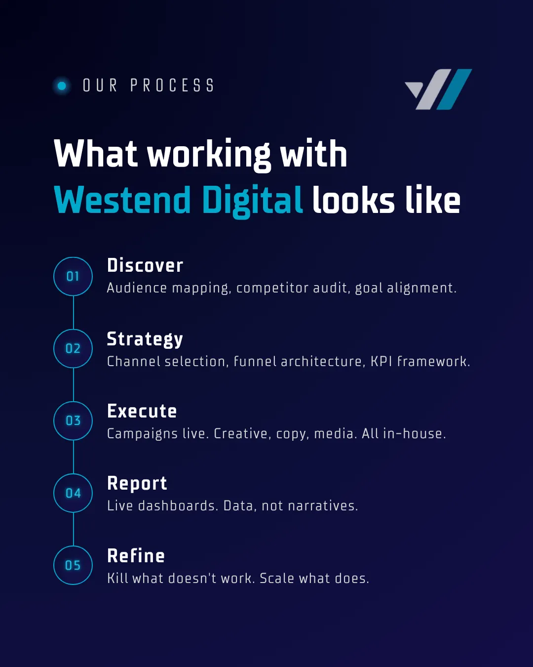
Step 1, Position. A structured intake, done once, before any prompt gets written: positioning, audience, tone, and, just as importantly, three things the business explicitly does not want to look like.
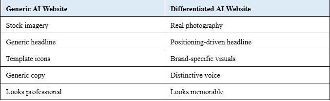
Step 2, Personality. The voice, language, and point of view that separate you from a competitor offering the same service. This is where generic AI copy gets rebuilt into something that actually sounds like you.
Step 3, Proof. Real photography, real testimonials, real case studies, swapped in for the stock imagery and placeholder icons the AI defaults to. Proof is the fastest way to make a site stop looking interchangeable.
Step 4, Polish. The human design pass. Structure stays, because the AI usually gets structure right. Iconography, colour, spacing, and visual rhythm get rebuilt, because that's the part carrying your brand.
Step 5, Performance. Conversion tracking and testing after launch, so the site keeps earning its place instead of sitting untouched for another two years.
None of this requires you to learn prompt engineering. It requires someone in the process, us, or a partner like us, to supply the judgement the tool was never designed to bring on its own, and it's the same process behind our [AI consulting](/services/ai-consulting) work more broadly.
Is your website an AI twin? Quick self-assessment
Tick every box that applies to your current site:
[ ] A free AI-detection tool flags common patterns associated with a known AI builder on your site
[ ] Your homepage copy sounds fine, but could apply to almost any competitor
[ ] A competitor's site has the same section order and layout as yours
[ ] Your site uses stock photography instead of real photos of your team or work
[ ] Your icon set looks like it came from a generic template library
[ ] Your headline could be swapped onto a competitor's site with no one noticing
If you ticked three or more, your website probably has a twin. That's not a definitive test, it's a pattern match, and it's worth a second look before you spend another dollar driving traffic to it.
Frequently asked questions
NDIS providers are usually talking to several audiences at once, and one platform cannot do all of that work equally well.
Can people tell if my website was built with AI?
Often, yes, even without knowing exactly what tipped them off. Free detection tools can flag patterns commonly associated with specific AI builders, colour gradients, component libraries, and icon sets that repeat across thousands of unrelated businesses, though these are indicators, not certainties. Visitors don't need a tool to sense it. The half-second "I've seen this before" reaction does the same job
Does Google care if my website is AI-generated?
Google's guidance focuses on content quality and usefulness, not how a page was produced. The real SEO risk isn't that a site was made with AI, it's content homogenization: when thousands of sites share near-identical structure, headings, and phrasing, search engines have a harder time finding a reason to rank any one of them above the rest. Differentiated structure and original proof points are what earn ranking signals over time, regardless of what tool built the first draft.
Are AI website builders bad for SEO?
Not inherently. The technical output is usually clean and fast-loading. The risk is thin, repeated content and structure across thousands of similar sites, which makes it harder to earn the distinctiveness search engines increasingly reward. A well-briefed AI build with a human differentiation pass performs very differently from an unedited default.
Is Claude better than Lovable, v0, or other AI builders for a website?
They solve different problems. Builder-style tools (Lovable, v0, Bolt) are optimised for fast, templated output. Conversational tools like Claude are stronger when paired with a detailed brief and a human editing pass, because the quality of the result depends heavily on the quality and specificity of the input either way.
Why do AI websites all look alike?
Because the model isn't designing, it's predicting the statistically most likely layout for a given prompt, and that prediction converges on the average of everything it's seen. When thousands of businesses give similar prompts to the same handful of tools, they get variations on the same average output. It's a direct, structural consequence of how generative models work, not a limitation anyone is likely to accidentally prompt their way around.
Where that leaves you
AI gives you speed. Strategy gives you distinction. Brand gives people a reason to remember you.
If you're evaluating an AI website builder right now, the instinct toward speed and cost isn't wrong. Just go in knowing exactly what you're buying: a strong, fast first draft, wearing the same outfit as a few thousand other businesses, until someone applies the judgement that makes it yours.
Get a free AI Website Twin Audit. We'll run your site through the same checks in this article and tell you, honestly, whether you need a full rebuild, a short Differentiation Pass, or nothing at all.
Westend Digital is a Melbourne-based digital marketing agency working with small and medium-sized businesses across trades, healthcare, professional services, and hospitality. If you are setting a budget for your next ad campaign and want a second opinion before you commit, reply to The Westend Brief or visit westenddigital.com.au.